Designing CurbSight AI: A Brand System That Grew Into Itself
Some brand systems look great until you actually try using them.
July 20, 2026
Some brand systems look great until you actually try using them.
That’s what ended up happening with CurbSight AI. The design system was built and looked great! As we began building a homepage and other assets, a good majority of the system started to feel wrong given the applications the system was being implemented on.
The colors contrasted nicely, the type had a working hierarchy, and the logo was decided upon. After trying to design a few postcards, something felt wrong despite the system being “correct” in terms of good design.
Throughout the process, we chose to ease up on the design system constraints, breaking them intentionally and letting ourselves explore what this system could look like given the materials it would be applied to.
About the Project
CurbSight AI is a marketing tool that helps landscape companies market an entire neighborhood at once.
A landscaper maps out a group of homes they want to target and market to, then CurbSight uses AI and Google Street View imagery to create personalized postcards showing reimagined landscapes for each property.
The homeowner scans a QR code, answers a few questions through a chat interface, and receives a full design vision book which covers things like plants, hardscaping finishes, materials, and the overall vibe for their yard.
Our role covered the brand identity, marketing site, design vision book, and the postcard mailers.
A Survived System
The first version of the CurbSight identity was perfectly fine. You could put it all on a brand board and it looked like a true completed design system.
But then we tried actually using it.
The homepage needed more range and sophistication than the original color palette had. Certain type combinations looked good in a presentation but when utilized on a homepage, felt unprofessional or too playful. Some of the choices had a landscaping aesthetic, but weren’t doing much to help us design the product.
We did not want to force the design system into places where it didn’t seem to fit. If we did, yes, the design system would be “successful,” but the website and assets wouldn’t have felt right.
The second version came from small corrections, and eventually those corrections added up to become more complete and personal. Every color, type size, and component shape had already been used somewhere real before it earned a permanent spot in the design system.
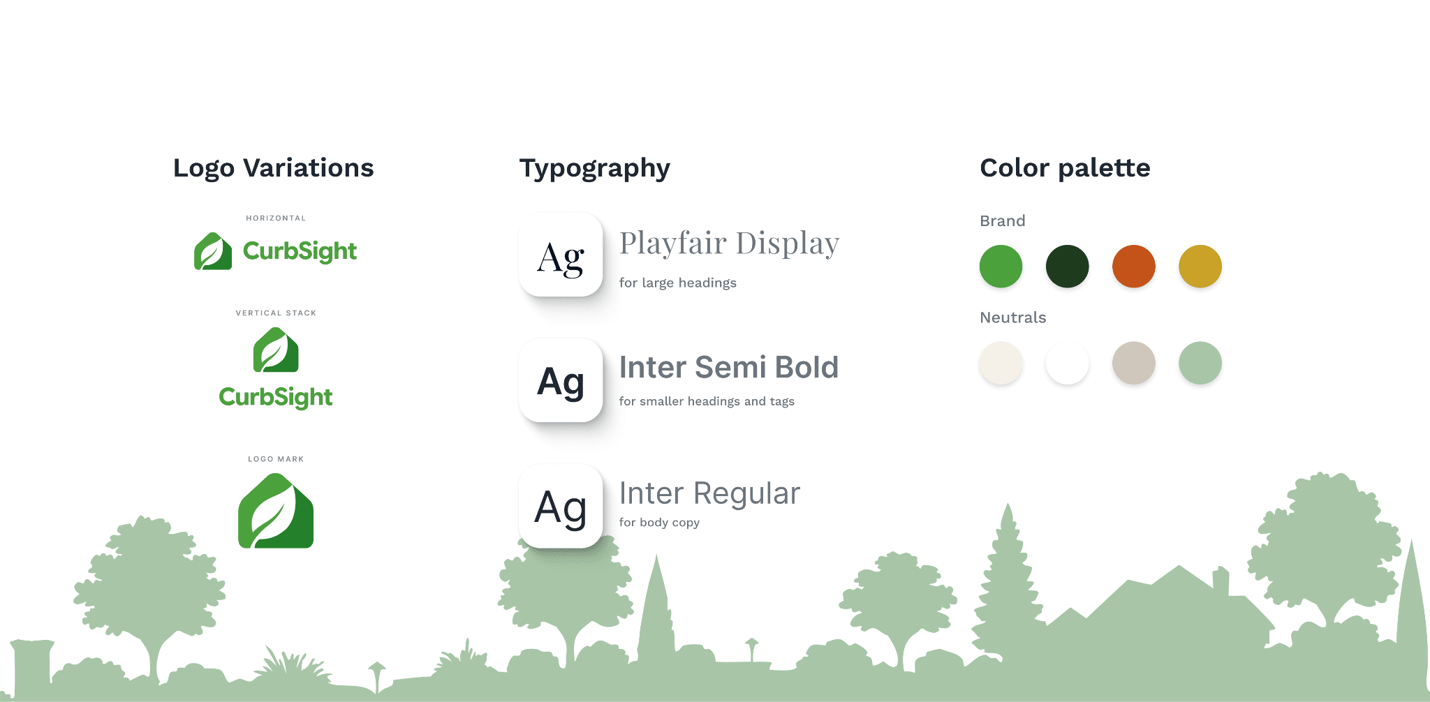
The CurbSight brand system, second draft. Every piece slowly adapted into the above system, all while building the homepage.
The Goal is to Grow
We did not want to design a landscaping product that looked like every other landscaping-related website. The entire product is about helping someone imagine what their yard could become, and the homepage needed some of that same energy and character. How can we invoke a feeling of evolution or growth to users within a homepage?
After scrolling past the hero section, users find the main six-step section that literally “blooms” from the ground up. The steps climb and branch upward along a green vine that connects the entire process.
The steps spread across a dark, soil-textured background that dissolves into the section above it. Then there is the high-contrast terracotta block at the bottom. It’s intentionally different from the previous five steps listed because it’s the most important one.
We want users to fully understand the primary goal of CurbSight AI: book more consultations.
That outcome needed its own space, color, and treatment to ensure users fully understand the purpose. The rest of the process grows directly out of it.
Everything is “rooted” in the part that actually benefits the landscaper.
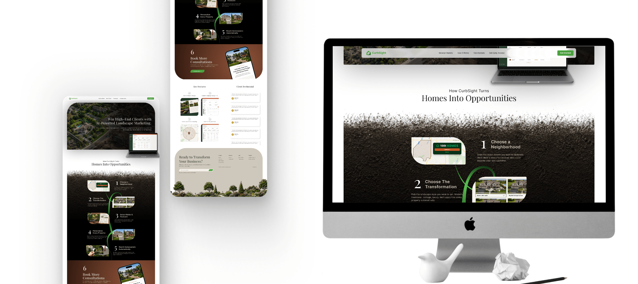
The final version of the homepage. The steps bloom upward from the terracotta block, which works as both the pot and the payoff of the product.
The plant idea also shows up in the smaller parts of the interface.
The map card, transformation picker, feature cards, and buttons all use the same asymmetrical corner radius. The top-left and bottom-right corners are more rounded. The other two stay tighter, forming a leaf-like shape.
Most people will never look at one of the cards and say, “Wow, that rectangle kind of looks like a leaf.” (Which is probably a good thing.) But the people who do notice might appreciate the system a bit more.
The shape just makes the interface feel a little more specific and intentional to CurbSight. And it gives all of the components a shared detail without covering the page in leaves, vines, and other obvious landscaping graphics.
A System for Skimming
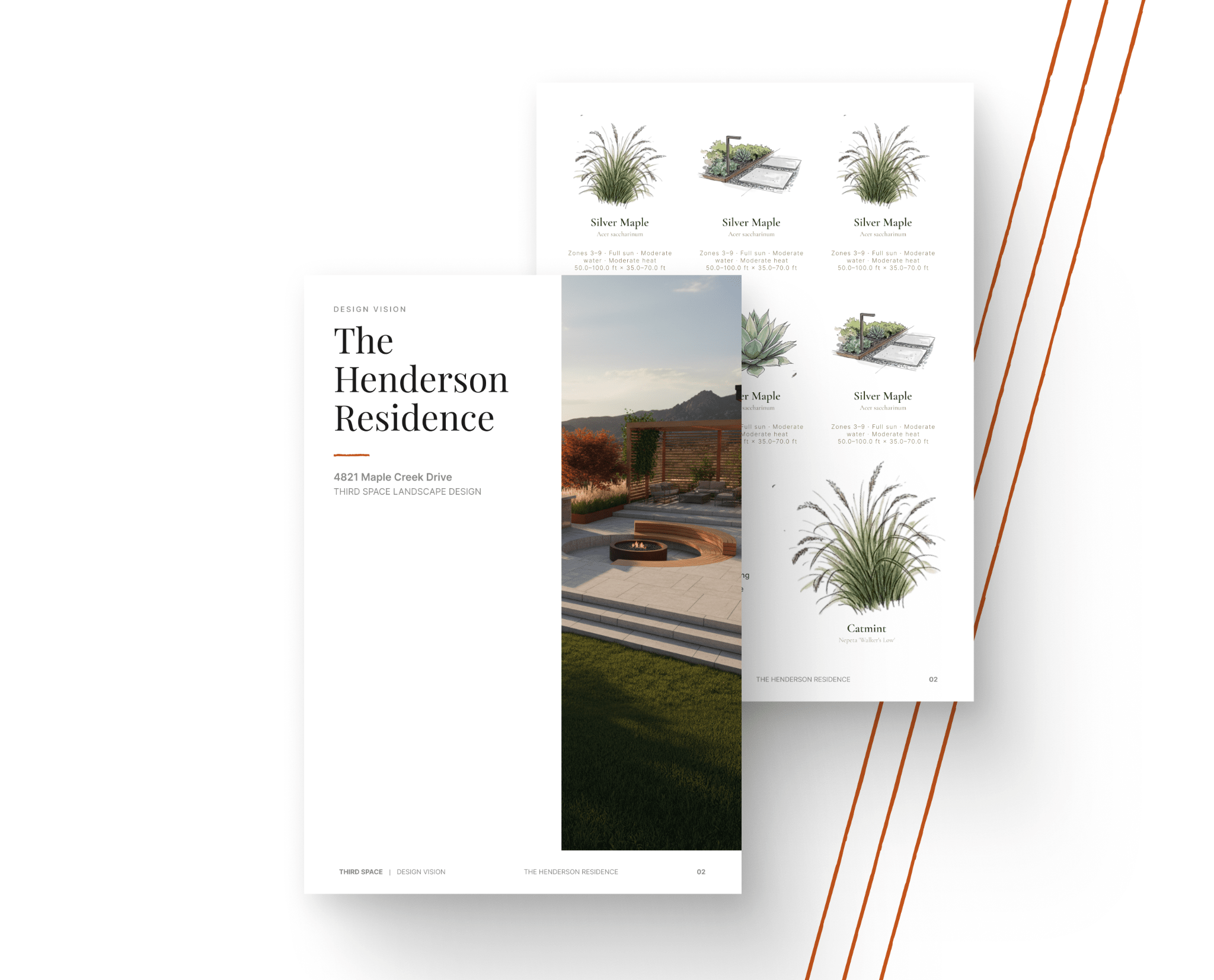
The last piece of the project was the design booklet homeowners receive after scanning the postcard and talking to the chatbot. The content changes based on the homeowner, their property, and the direction they choose, but the layout of the design vision book stays the same.
The grid, hierarchy, typography, margins, image placement, site-plan treatment, and plant palette pages all follow a fixed system. This is intentional so the AI has room to generate the content, but it does not get to decide how the whole book is actually designed.
The booklet needed its own approach because a booklet PDF behaves completely differently from a website.
On a website, we can use the scroll to our advantage. A section can take up two full screens if it needs to. Content can reveal itself slowly. Animation, spacing, and movement can all help guide someone through the story and sell them on an idea.
A PDF booklet has to work immediately. The homeowner opens it and sees the entire page at once. The hierarchy has to be clear before they even start reading.
We leaned into more editorial-style elements with large Playfair headlines, wide margins, generous white space, and running footers. It needed to feel like a full team of people at a landscape design firm spent real time preparing it for a specific homeowner.
Anything that starts to resemble an AI-generated report hurts that feeling very quickly.
The fixed layout keeps that from happening and gives the generated content enough structure to feel intentionally placed, even when every booklet contains something different.
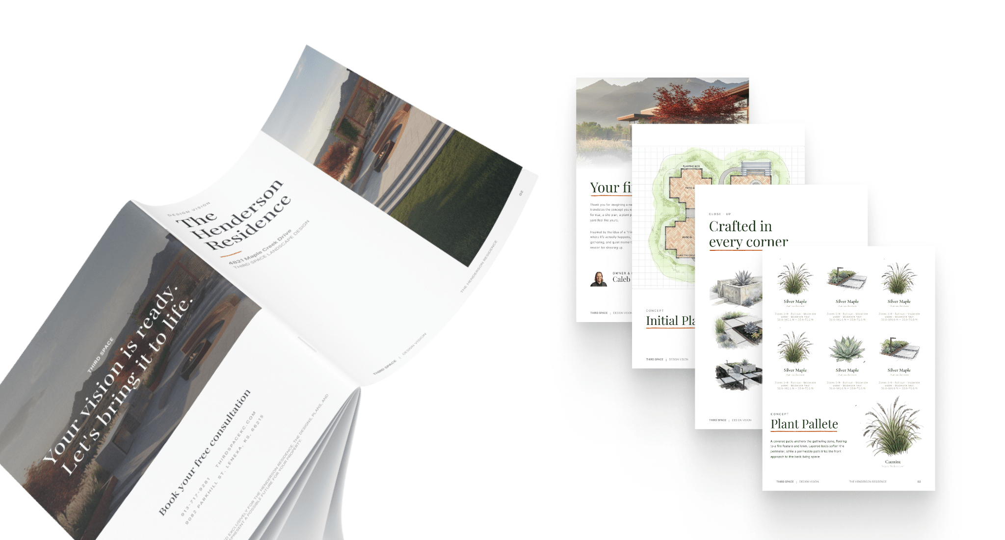
The design booklet homeowners receive. AI generates portions of the content, while the layout, hierarchy, grid, and type system keep the final result consistent.
Takeaways
Build the system while you build the thing
A brand board can tell you whether the pieces look good together. A homepage tells you whether they are actually useful.
The final palette and type scale earned their spots by surviving real design iterations, real content, and real interface problems.
Let the subject matter affect the structure
The plant metaphor gave us more than a visual style.
It shaped the order of the page, the way the steps flow, the position of the final outcome, and even the radius on corners of the interface components. That all went into giving the homepage a story without needing to explain the metaphor.
The first draft of the brand gave us enough to start building. The process of designing the homepage, booklet, and other assets truly finished it.