Welcome Vika!
A closet app for minimalists

November 10, 2021
Hi, I’m Vika. I moved to the US in August 2020 from Moscow, Russia. I was always interested in design and when I learned that UX is a perfect combination of working with people and doing design, I didn’t doubt this would be a great fit for me.
I learned about Brand New Box from my friend who worked there and I was lucky to get an interview with Matt Kirkland. Shortly after starting at BNB, I got a chance to work on my self-guided design project - which I am excited to tell you about!
Capsule Wardrobe App - Mobile Application for organizing your clothes and styling your outfits.
For my project, I wanted to design a mobile app for people who are interested in organizing their clothes and creating a capsule wardrobe. I started by brainstorming the functionality I would like this app to have. Then I narrowed it down to the basic functionality that would make it into the MVP of the app.
-
The MVP would allow users to:
- Upload pictures of the clothing items they own and organize them by categories and filter them by type, color, style and season.
- Combine clothing items into outfits, organize and filter those outfits by style, color, season and items in the outfit.
- Schedule outfits for the future with the calendar feature.
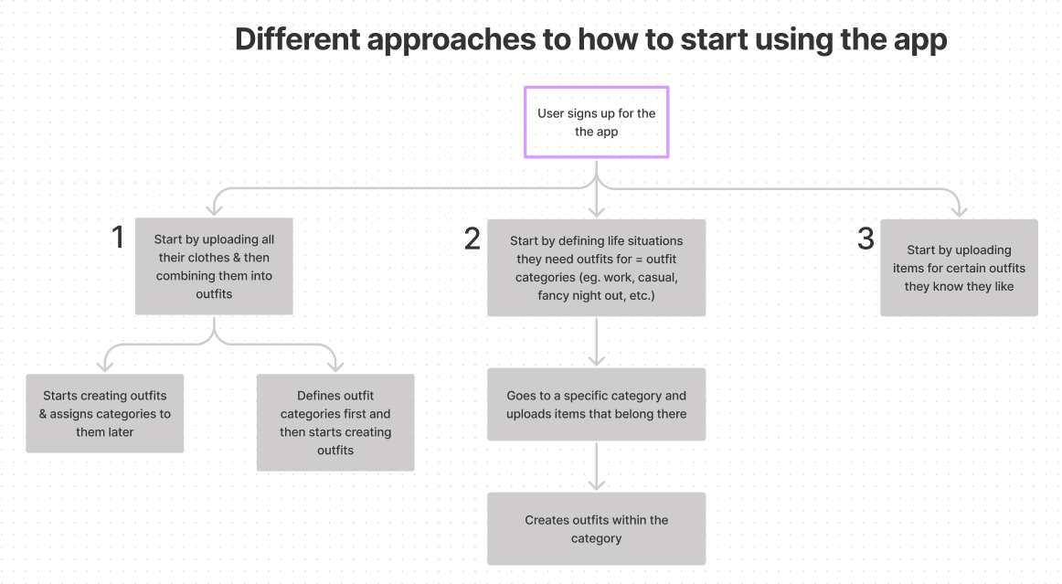
I started the process by thinking about different approaches people might take when organizing their wardrobe. For instance, some users might start by uploading pictures of all of their clothing items and then combining them into outfits, some might begin with defining different occasions in their life they need outfits for and upload items withing a certain category first, and etc. This helped me define informational architecture of the app.
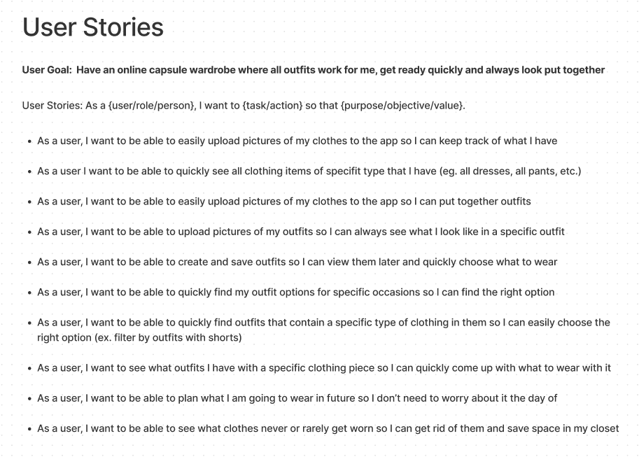
To better understand what features need to be included into the MVP and to have something to refer to while building all of the screens for the app, I wrote down user stories. My goal was to make them granular and not too general to make sure I covered all of the important functionality.
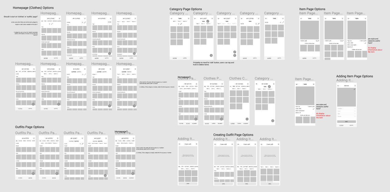
As my next step, I started working on some basic wireframes. I built a few core screens to start the ideation process and defined what the structure would actually look like in an interface.
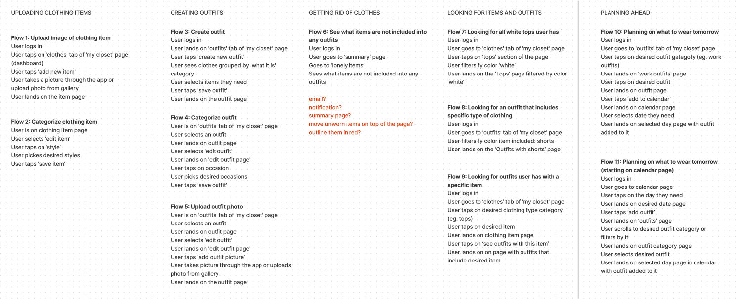
As soon as the basic wireframes were approved I moved to creating more detailed mid-fidelity wireframes and building a few userflows that I later used for usability testing.
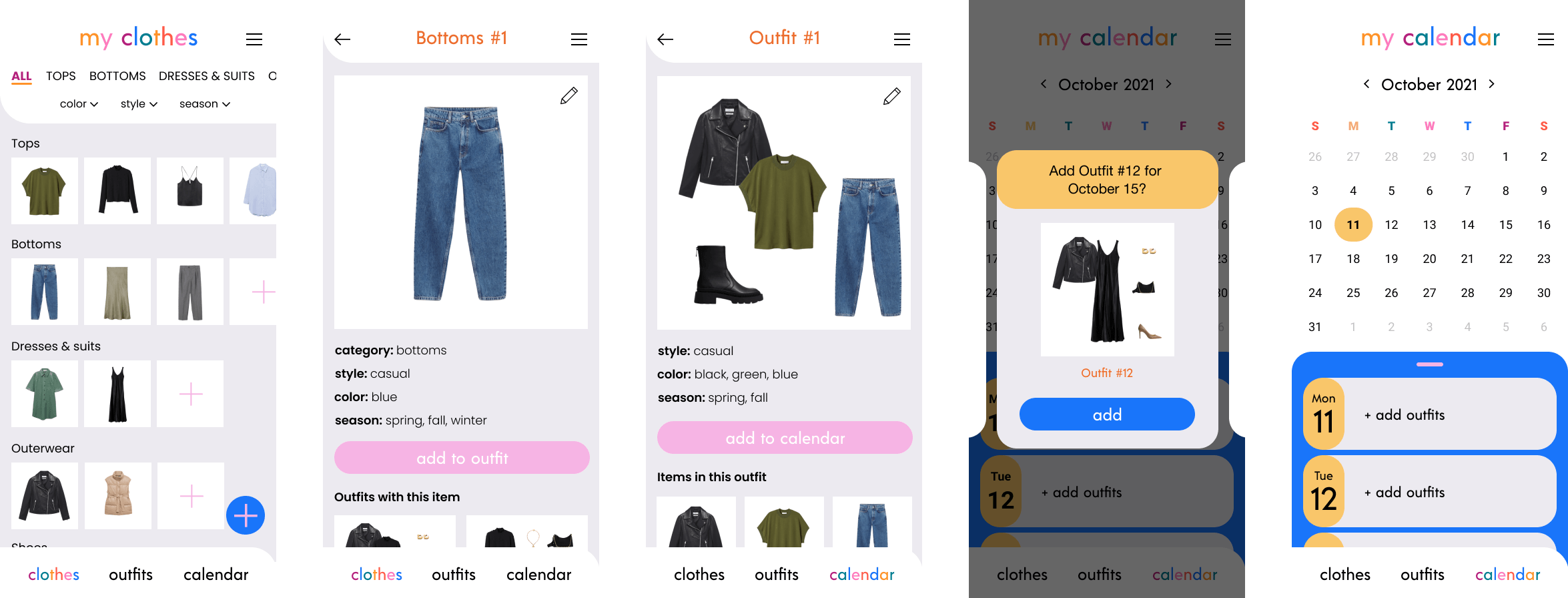
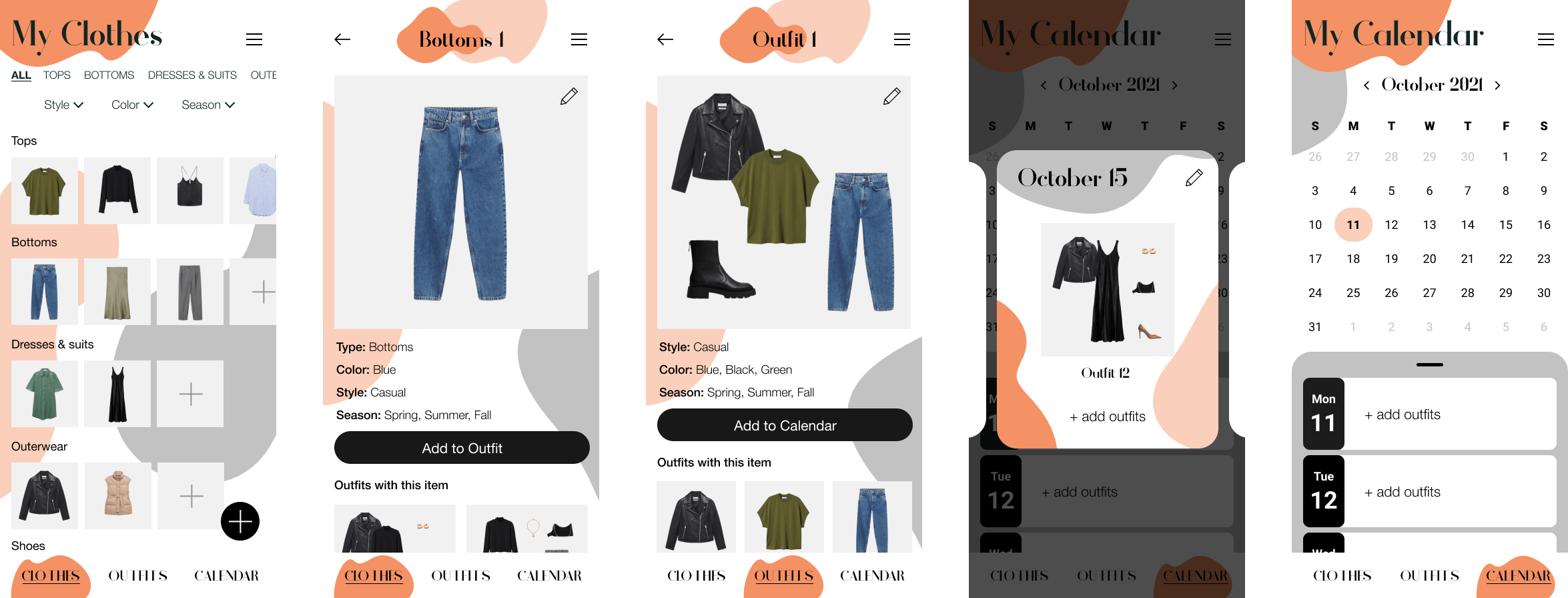
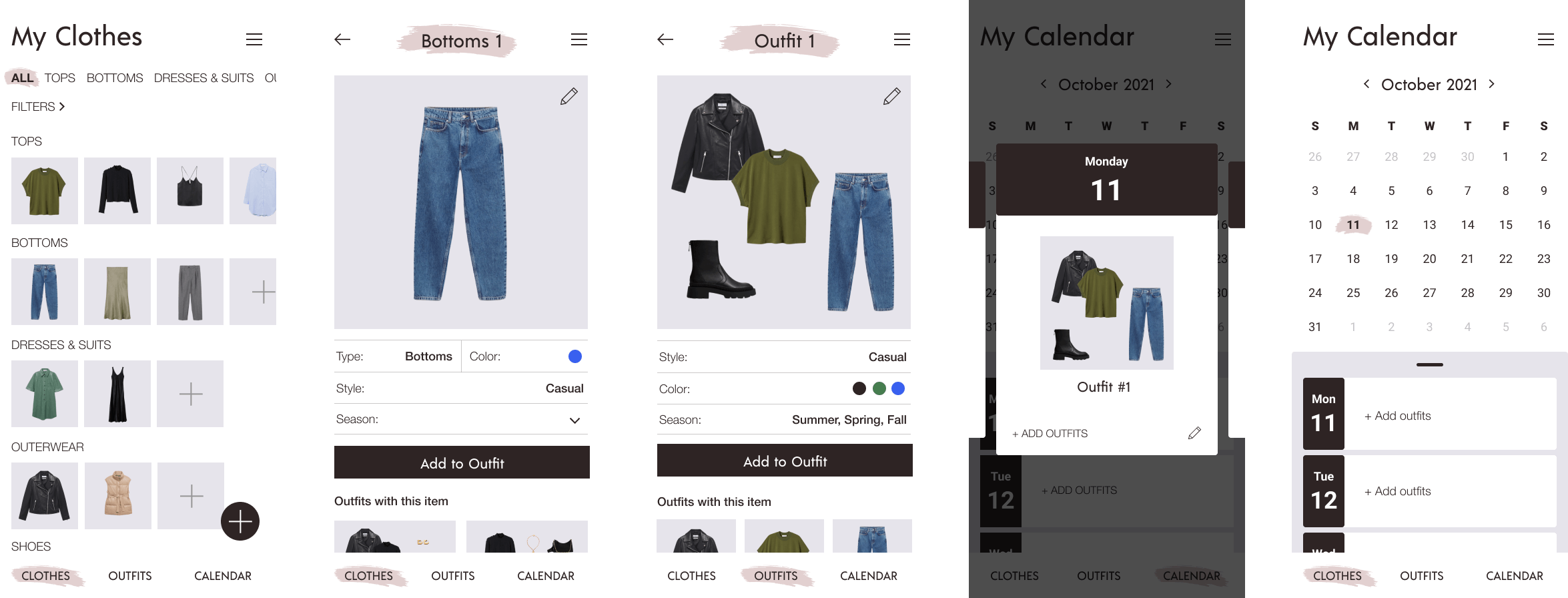
The design I came up with had three main tabs: Clothes, Outfits and Calendar. On the Clothes tab users would be able to upload pictures of their clothing items, categorize them by type or clothes and filter them by style, color and season. They would also be able to go to the a page for each item, see information about it and view all of the outfits they had with that item. On the Outfits tab users would be able to create outfits using the clothing items they had added. Then they would be able to categorize their outfits by style and filter them by color, season and items included. From a page dedicated to a specific outfit users would be able to access information about the outfit, add a photo of them wearing it and quickly add it to their calendar. On the Calendar tab users would be able to plan ahead what they’d wearer by adding outfits for certain dates and view the outfits they scheduled for the future.
-
I tested the prototype with 6 users and as a result made two major changes.
-
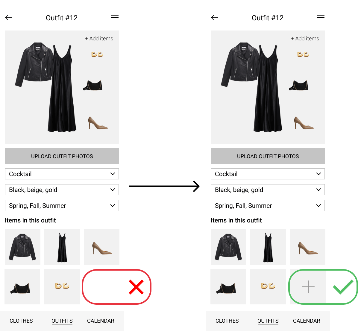
I noticed that when I asked users to add a new item to an existing outfit, more than 50% of participants scrolled down on the page of the outfit and looked for an ‘add’ button in ‘Items in this outfit’ section. So I added the button where users expected it to be.
-
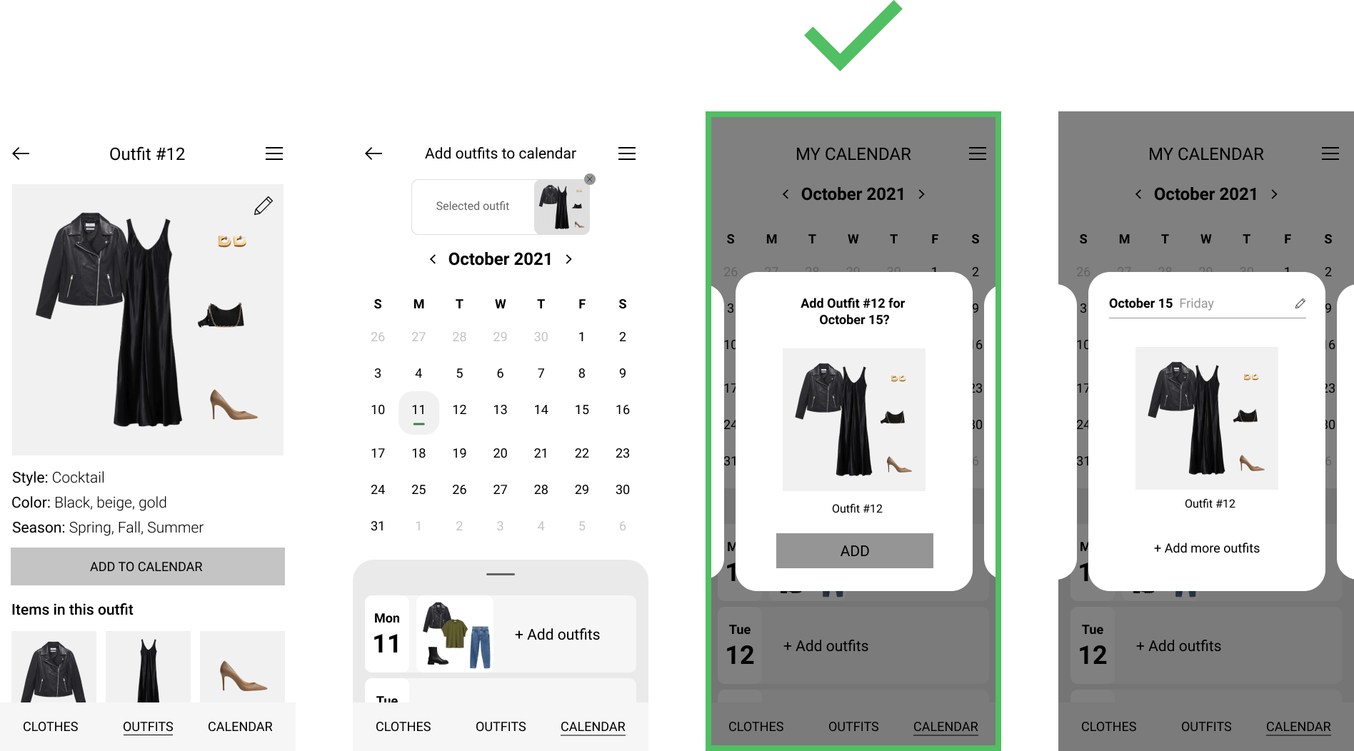
Another change I made after testing was adding an extra confirmation screen when scheduling an outfit for a certain date in the Calendar. In the first version of the design, after users selected an outfit and a date to add it for, the outfit would automatically get added for the selected date. 4/6 users mentioned that they were not sure if they added the outfit as there was no confirmation after the action was completed and no button to confirm the action before it was done.
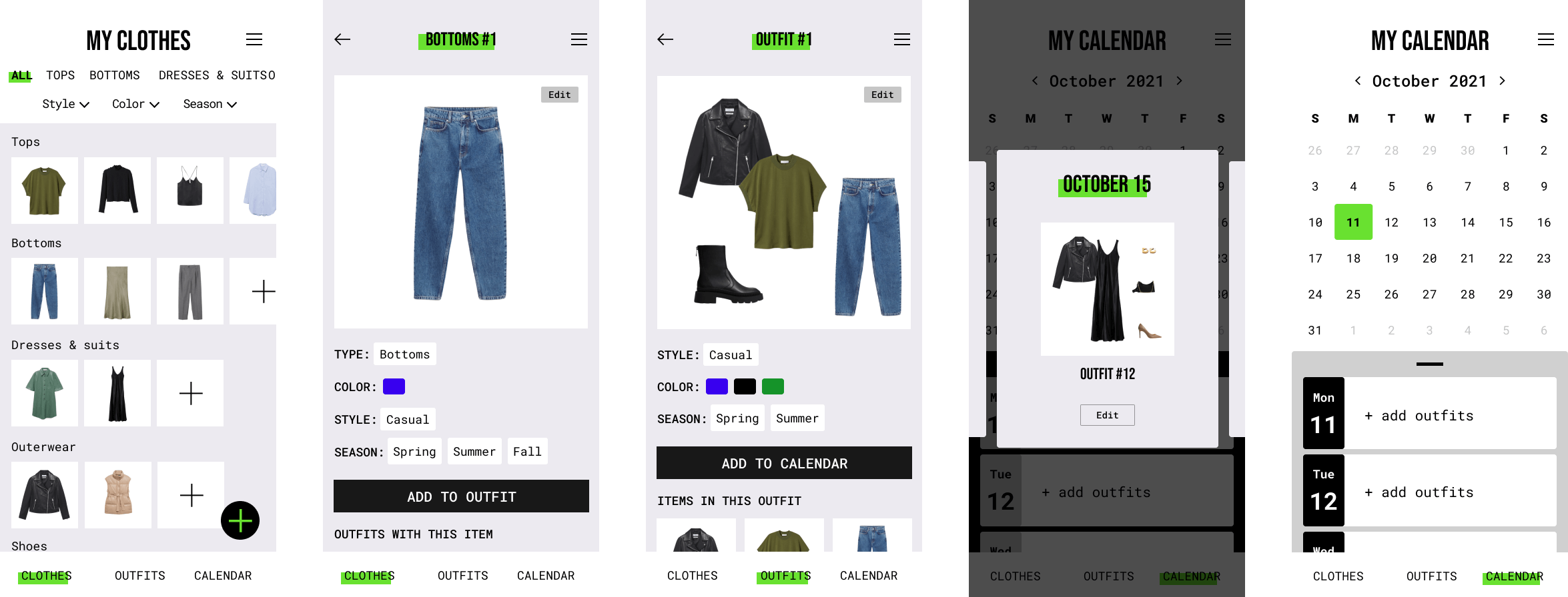
For my final style I drew inspiration from websites of brands like Chanel, Versace, Mango and Zara. All of those have mostly black and white designs with a lot of straight lines and simple shapes that really make the content stand out. I wanted to create something similar but added a small color accent.
After talking to Matt we both agreed that Option 4 would be the best for this specific app. Users would be uploading a lot of content and the visual design of the app should not conflict with the user generated content. Also, users who use this app might have very different fashion styles and an app like this should be a good setting for any style they prefer.