New Tech for the WSC
A small project to help students learn a big list
March 15, 2023
Two of our core values at BNB are curiosity and creativity - we love learning new things and making new things. A long time ago, Matt launched a personal project to make one physical illustration for each of the questions in the Westminster Shorter Catechism. That project fizzled out (he got busy with BNB stuff!), but it was a great exercise that helped think through these weird questions - combining both learning and making.
Fast forward ten years. Brand New Box got a dream call: can you build something new to help students learn the Westminster Shorter Catechism?
Heck yes we can.
The Presbyterian Church (U.S.A.) has a great scholarship available for students who can learn the WSC. It’s called the Samuel Robinson Award, and to be eligible, students must demonstrate that they’ve memorized all 107 questions and answers in the catechism.
The problem is: that’s a lot of memorization! Students were intimidated by this task, and PCUSA wanted to make it easier for students to practice the WSC, and increase the odds that students can actually get this scholarship.
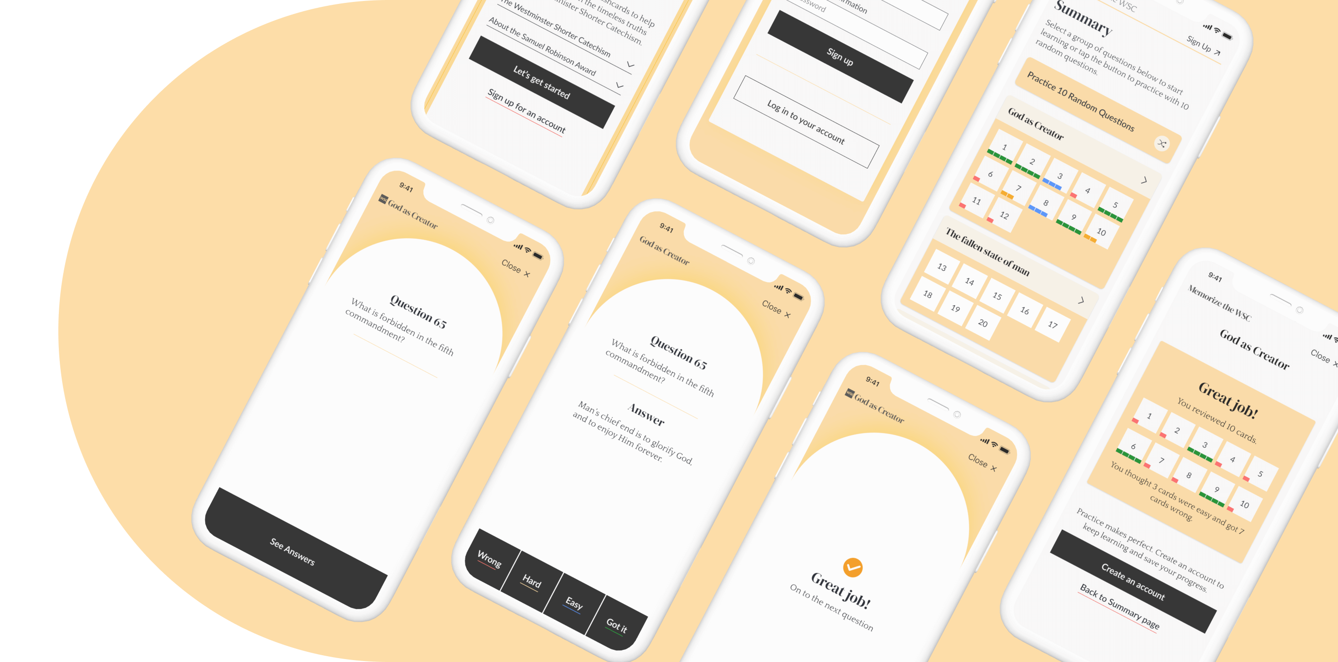
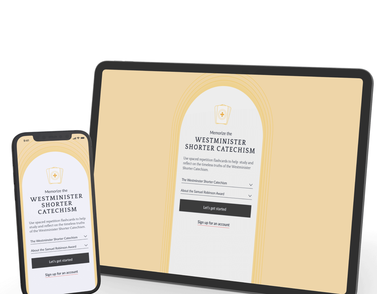
So! We designed and built a new tool to help, a spaced repetition flashcard app. You can work your way through the app as you practice your memorization, and get guided feedback about which ones to work on.
Wait, what’s the Westminster Shorter Catechism?
The WSC is a series of questions and answers used to formulate some basic theology - its text has been used for centuries to learn and understand essential teachings of faith. It’s made of a series of questions and answers that cover a wide range of topics, including the nature of God, the nature of humanity, and the way of salvation.
What is spaced repetition?
Spaced repetition is a method of memorizing information by actively reviewing it at increasing intervals of time. The basic idea is that our brains are better at retaining information when they have time to forget it and then re-learn it. So, instead of cramming information right before a test and then forgetting it soon after, you review the information at spaced intervals. This helps you reinforce the information in your memory, leading to better long-term retention and recall.
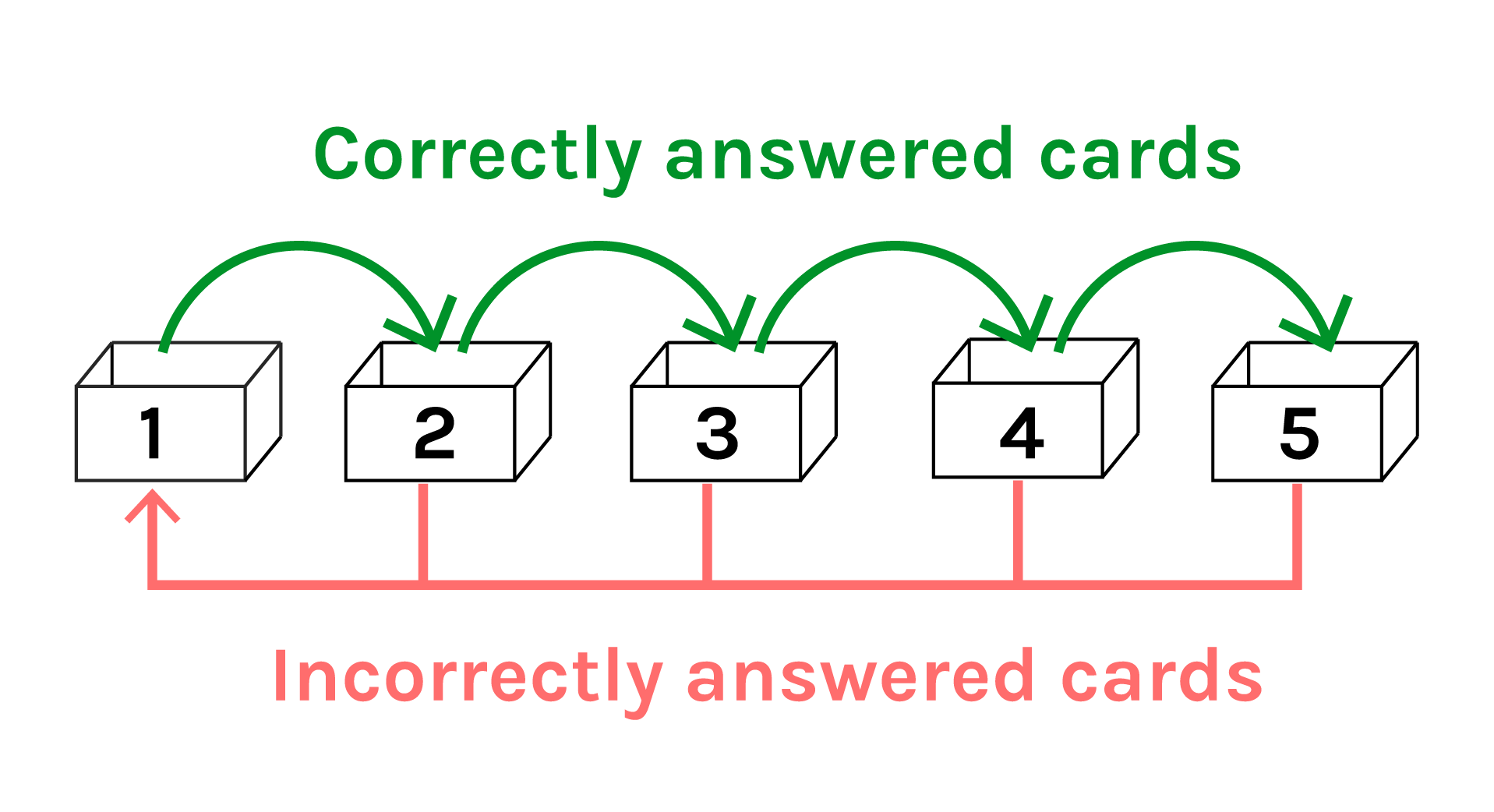
Correctly answered cards are advanced to the next, less frequent box, while incorrectly answered cards return to the first box for more aggressive review and repetition.
Using SuperMemo to schedule reviews of the next questions
This project uses SuperMemo, a specific form of the spaced repetition method, in which an algorithm determines the optimal intervals for reviewing information. It works by tracking how well you remember the information and adjusting the review schedule accordingly. When users mark a question 'difficult', it will be reviewed more frequently; while questions marked as 'easy' will be reviewed less frequently. This way you spend your study time efficiently, reinforcing the information that you need to remember the most.
Each time the user tests their knowledge is called a repetition session. During a repetition session, users are prompted with all the cards which scored below a four on the previous quality assessment. The appropriate flashcards are randomly sorted before presenting to the user.
Design Process
-
Our usage goals are clear
- Create a friendly and easy-to-use experience
- Clearly display the user's performance
- Encourage users to save their progress
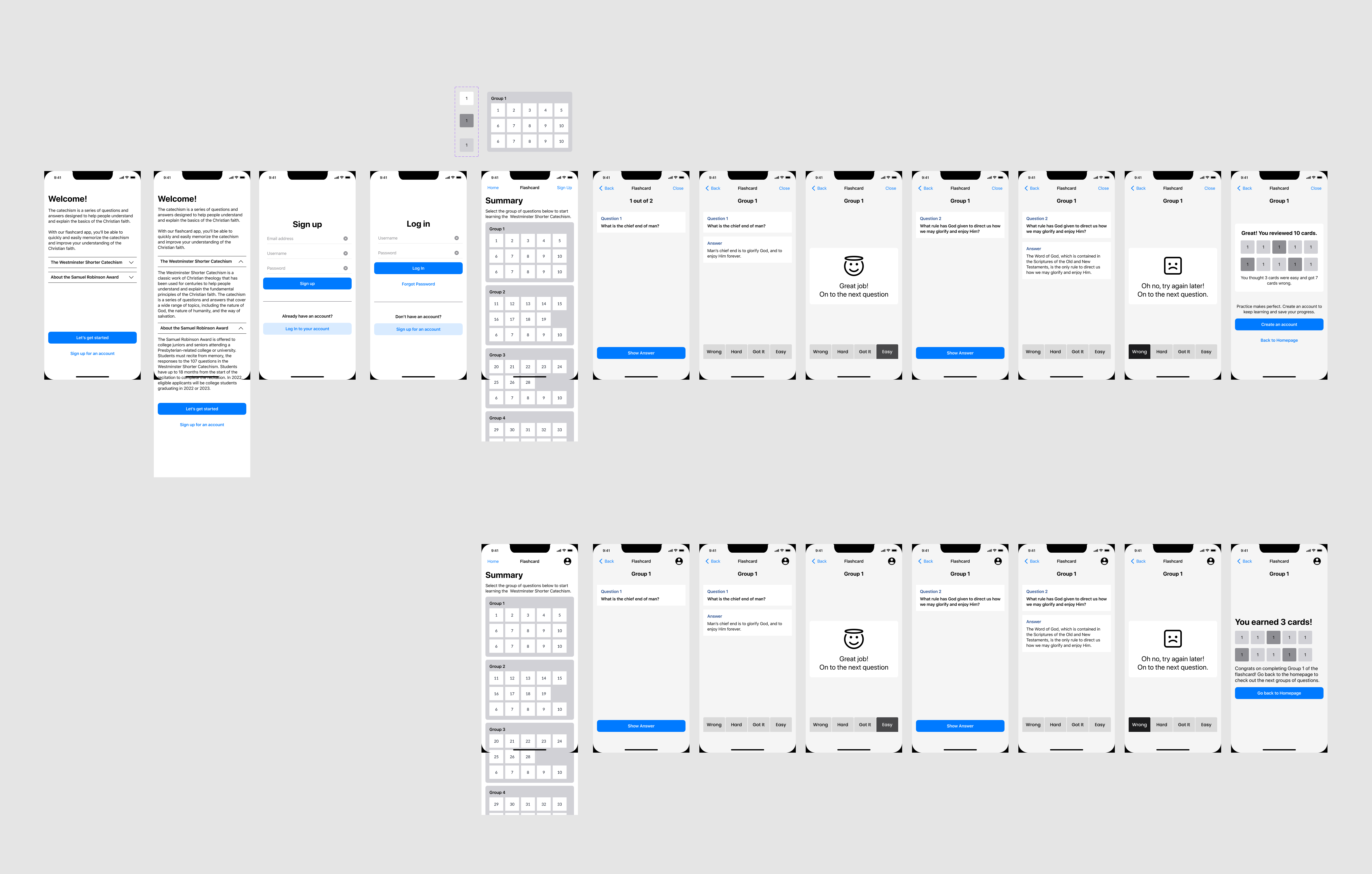
We benchmarked flashcard apps like Anki, Brainscape, and Quizlet that use the space-repetition method and took notes on how the flashcards were shown and how users moved through them. Then we did some wireframing, making sure the website was accessible on all devices - desktop and mobile.
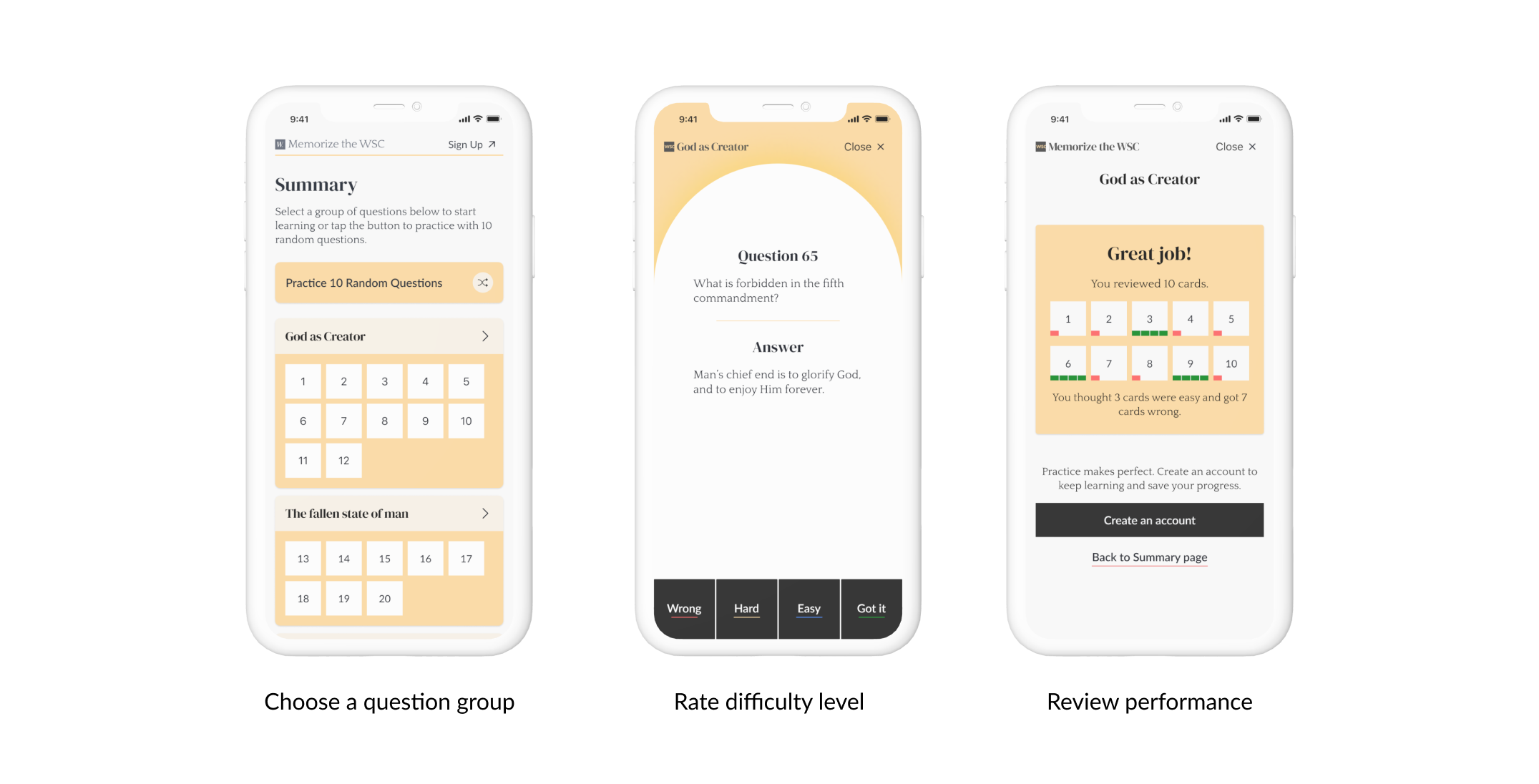
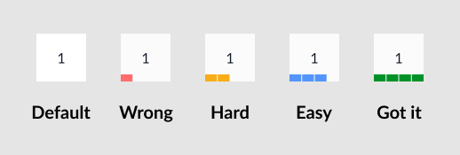
The UX is simple and straightforward. Users can review questions in groups and rate their difficulty, from easy to hard. This determines how often they are asked the same question. After they finish, they can look back and see what they thought of how hard each question was.
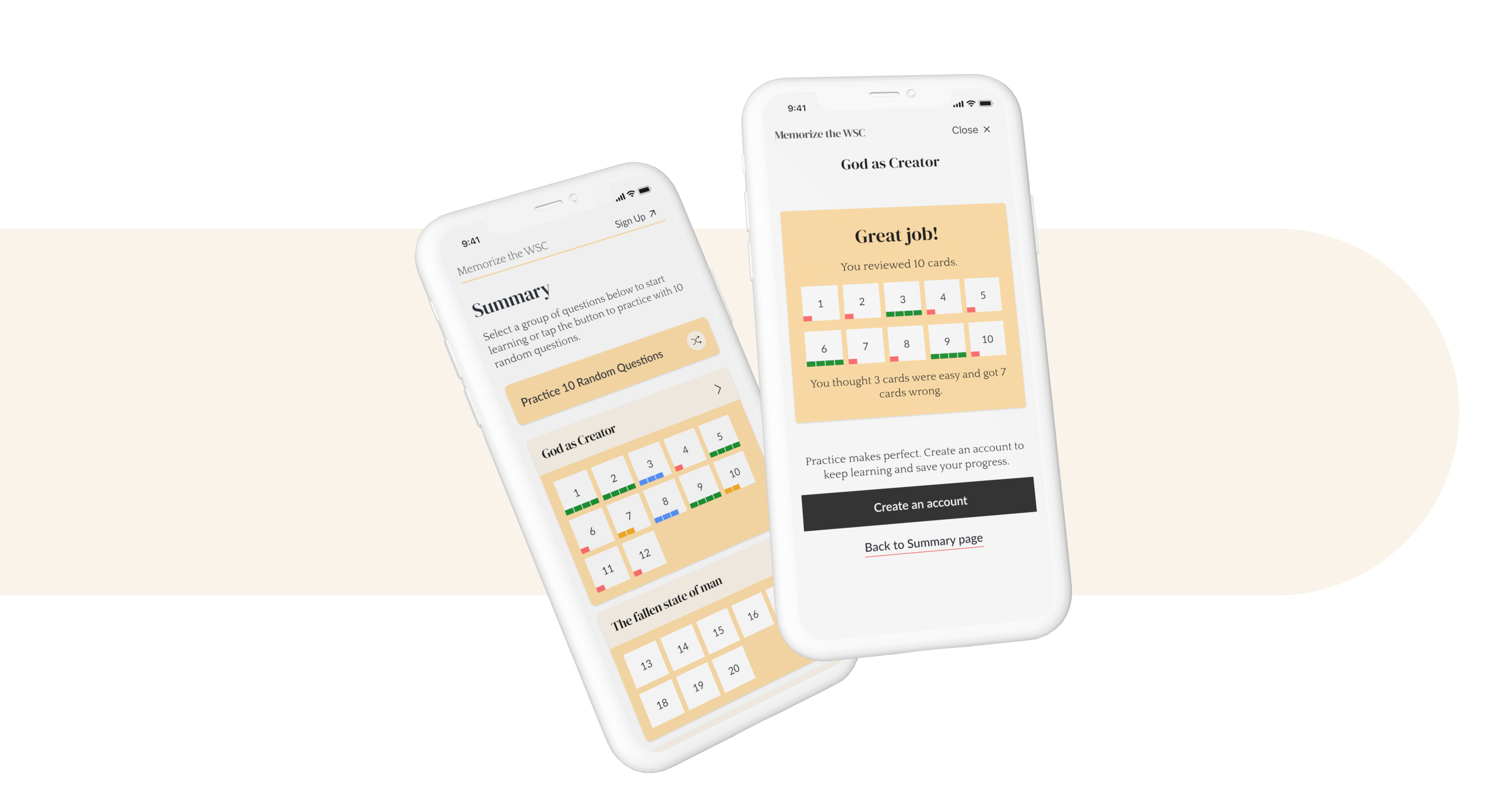
As a good accessibility practice, we didn't rely solely on colors to indicate difficulty levels. Instead, we created a progress indicator divided into sections. One bar indicated questions users found challenging, while four bars indicated correct answers.
Results
Our target audience includes college students, but also those engaging in more scholarly pursuits. As such, our design goal is to create a look that is both inviting and professional, appealing to both the casual user as well as the more serious scholar.
We tested a few different styles, experimenting with sleek and minimalistic, casual and friendly, and fancy and formal elements. Finally, we went with a warm and inviting color palette that included yellow and black tones. We complemented this with an elegant selection of typography, resulting in a sophisticated aesthetic. We used halo imagery and a glowing effect to create a sacred look that reflects the divine theme. We want to ensure that our design is user-friendly to all, while still maintaining a refined aesthetic. The end result was a visually stunning look!
You can try out the flashcards at: wsc.pcusa.org.
