Designing for Dignity of Risk: My ROAD Platform
How we helped the My ROAD team build a brand identity, design system, and website that centers dignity of risk for people with disabilities navigating life transitions.
June 8, 2026
How can we create tools that support real growth during life’s transitions, not by removing risk, but by making space for it?
That question sits at the heart of My ROAD, a collaborative initiative focused on embedding dignity of risk into the transition planning process for people with disabilities.
At the core of My ROAD is a straightforward but often overlooked idea: people learn by doing, and doing means accepting the possibility of failure. When we remove risk from someone’s life in the name of protection, we also remove the experiences that build confidence, resilience, and independence.
About the Project
My ROAD stands for My Risk for Opportunity, Autonomy, and Dignity. The initiative brings together researchers, educators, artists, and advocates who are exploring how people with disabilities can be better supported as they navigate major life transitions.
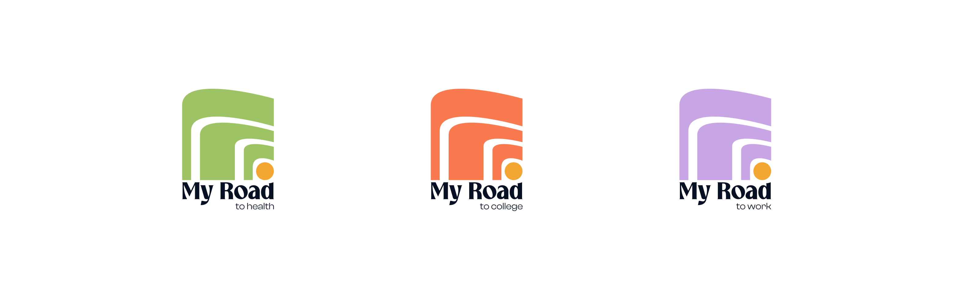
The project is organized around three pathways:
- My ROAD to Health
- My ROAD to College
- My ROAD to Work
Each pathway will have its own dedicated sub-site, serving as a home for resources, tools, and learning materials specific to that area. Over time, these spaces will house videos, downloadable resources, reflection tools, infographics, and other materials that help educators, families, and individuals explore dignity of risk in practical ways.
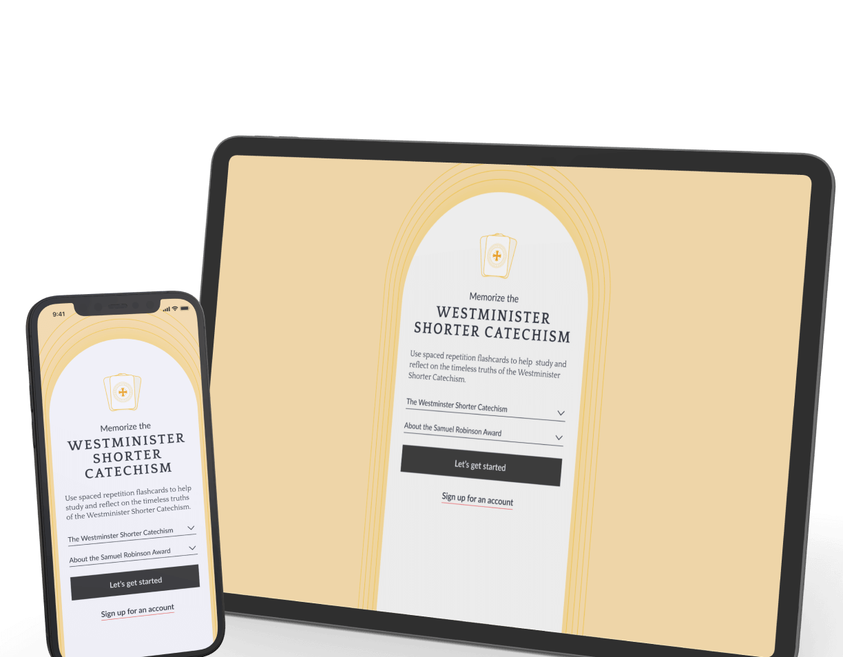
Designing with Dignity in Mind
When we first met with the My ROAD team, one thing became clear very quickly: they wanted to avoid many of the visual tropes commonly associated with disability-focused organizations. They were looking to move away from clip-art style illustrations, generic stock photos, and the institutional color palettes that tend to define this space.
Instead, they wanted something mature, optimistic, and authentic. The website needed to speak to professionals while remaining approachable for people with disabilities and their families. Plain language, accessibility, and respect for the audience became guiding principles throughout the project.
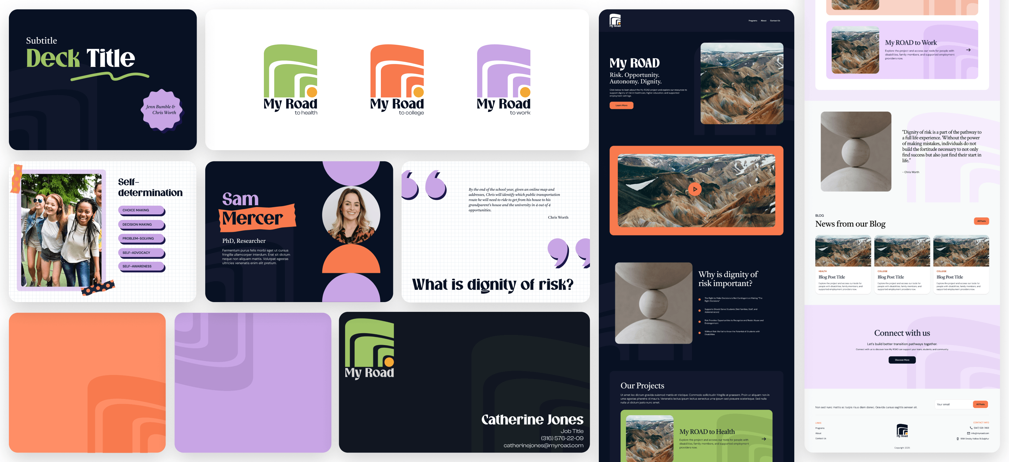
Our role included evolving the brand identity, creating a flexible design system for the three pathways, developing presentation and resource templates, and designing the future website experience.
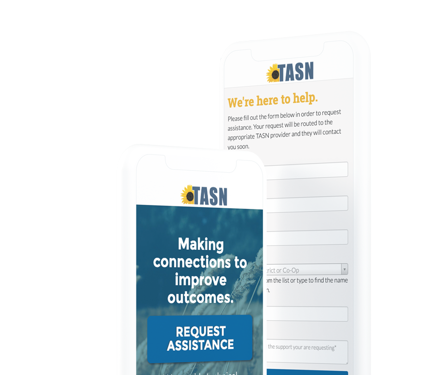
From the Original Logo to an Evolving Identity
The original My ROAD logo established an important foundation for the project. It introduced the metaphor of a road and a sun, representing movement, progress, and possibility.
As the initiative expanded, however, the identity needed to support a larger vision.
Rather than starting over, we focused on what already had meaning. One element we knew we wanted to preserve was the sun. It represented hope, opportunity, and forward momentum, values that remain central to My ROAD’s mission today.
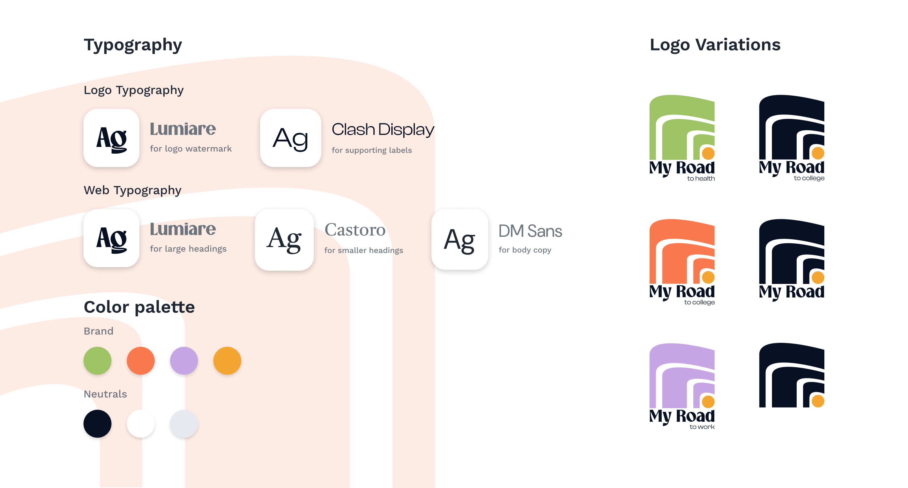
The redesign builds on those foundations while creating a more flexible system that can grow alongside the initiative. The identity now supports all three pathways while maintaining a consistent visual language across the broader My ROAD ecosystem.
The result feels more adaptable, more contemporary, and better aligned with the project’s belief that growth is rarely linear.
Color and Typography
The visual identity uses color to help distinguish the three pathways while reinforcing that they are all part of the same larger initiative.
The palette moves away from traditional institutional colors in favor of something brighter, warmer, and more optimistic. Each pathway has its own distinct expression, making it easier for users to navigate while creating a sense of energy and possibility throughout the brand.
Typography follows a similar philosophy. Rather than relying on a single typeface, the system uses a combination of fonts that create hierarchy and personality while maintaining readability. The result feels confident and modern without sacrificing accessibility, allowing the brand to work consistently across websites, presentations, toolkits, and future resources.
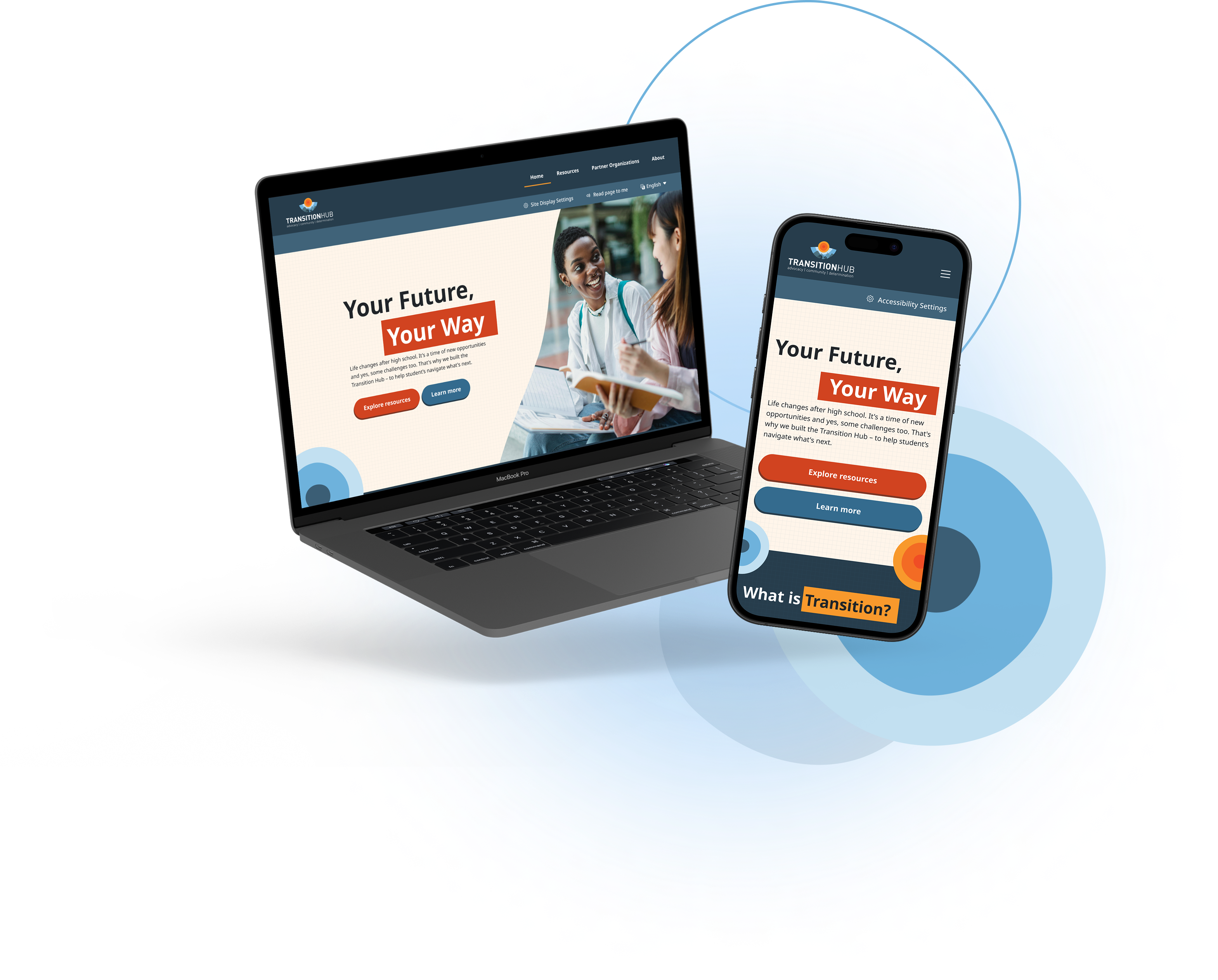
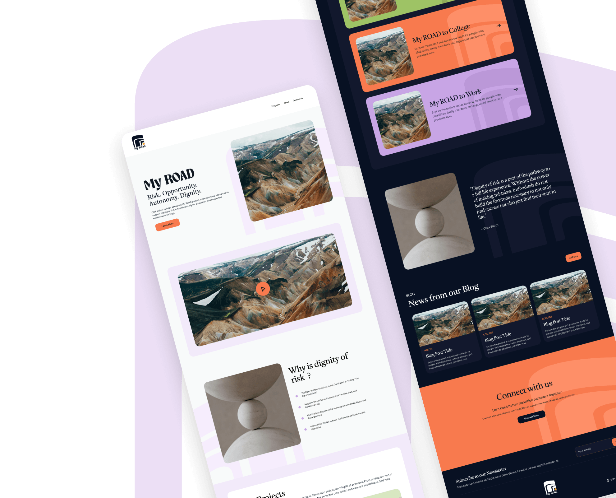
Bringing the Brand to the Web
With the identity system established, the next challenge was translating those ideas into a website experience.
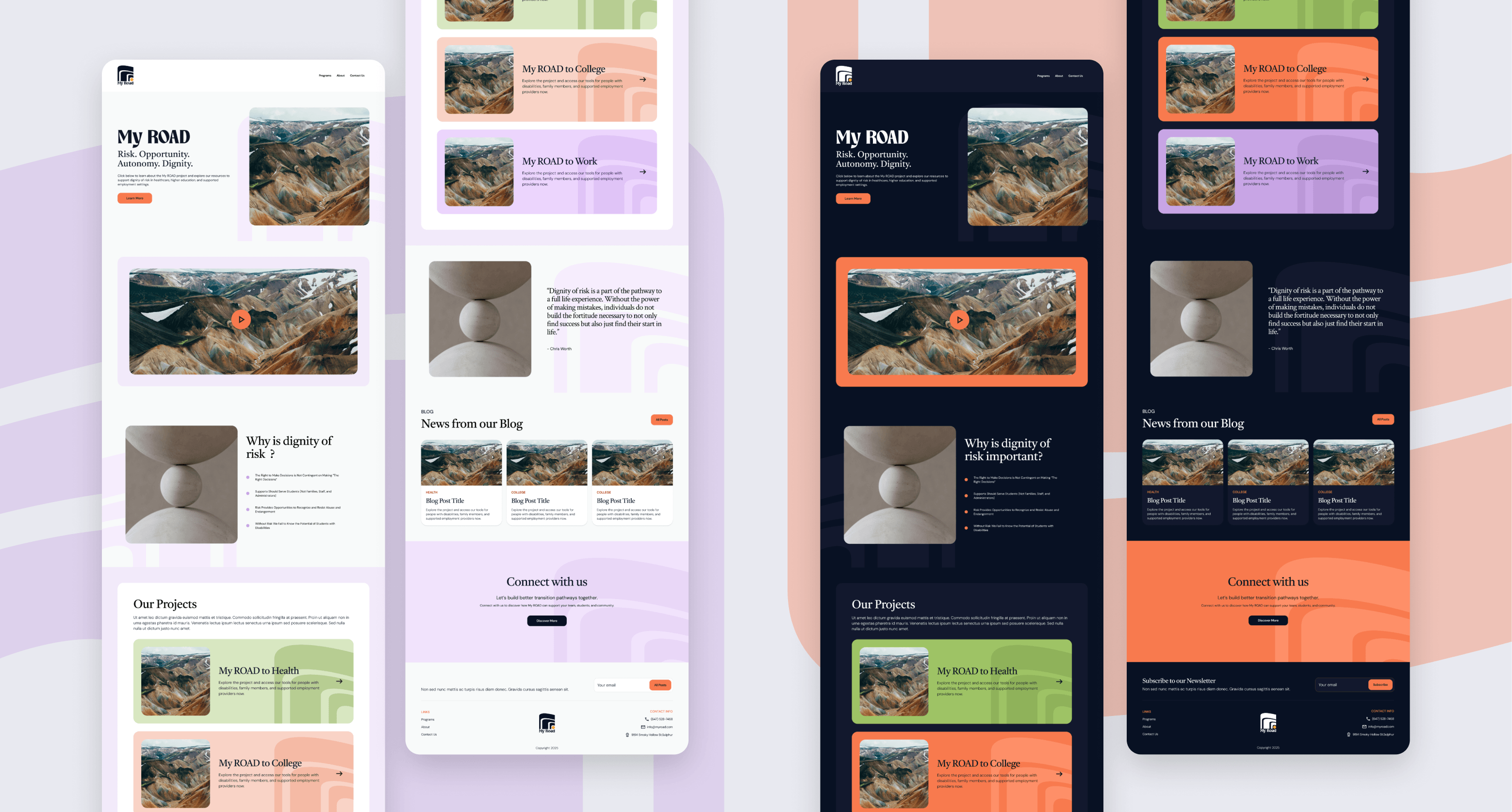
The My ROAD audience is broad. Educators, clinicians, family members, advocates, and people with disabilities may all arrive at the site looking for different information. Because of this, clarity became one of the most important design goals.
The homepage introduces the core ideas behind My ROAD before guiding visitors toward the pathway most relevant to them. Content is broken into manageable sections, using clear hierarchy and generous spacing to make information easier to scan and understand.
Rather than overwhelming visitors with information all at once, the experience encourages exploration one step at a time.
Visual Design Approach
One of the most important considerations was finding the right balance between structure and warmth.
The layouts use a clear, predictable rhythm that helps users understand where they are and what comes next. Repeated patterns, consistent spacing, and clearly defined sections create a sense of familiarity throughout the experience.
At the same time, the interface avoids feeling rigid or institutional. Rounded shapes, expressive typography, and the pathway color system bring personality into the design while keeping content accessible and easy to navigate.
We also explored both light and dark versions of the experience. While visually distinct, both versions are built on the same underlying system. The light mode emphasizes openness and clarity, while the dark mode introduces a greater sense of depth and focus. Together, they demonstrate the flexibility of the design system while maintaining a consistent user experience.
The imagery shown in the mockups is currently placeholder content, but the long-term vision is to incorporate original photography, artwork, and community-focused visuals that reflect the real people and stories behind My ROAD.
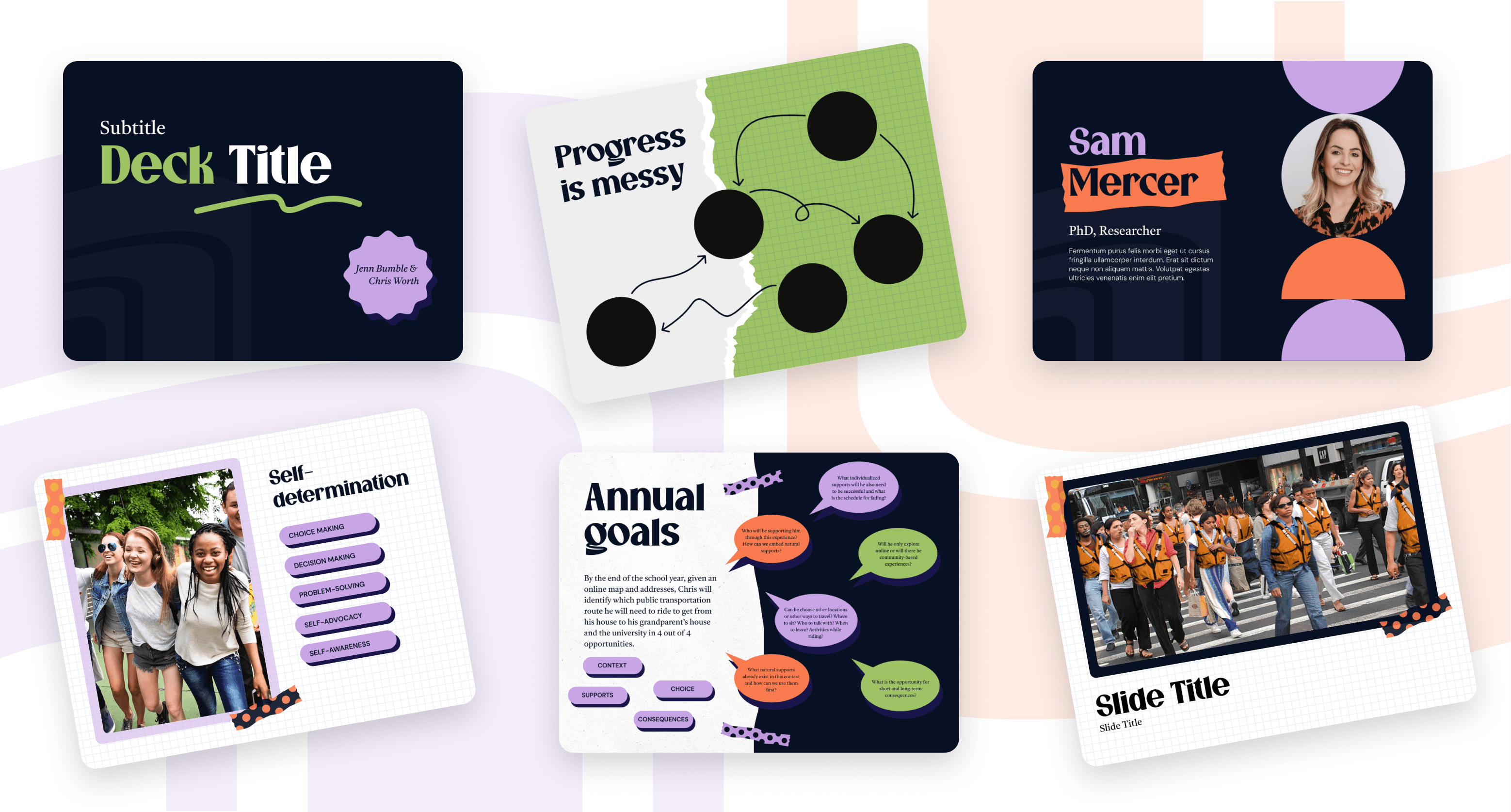
Bringing the Brand into the Room
A brand system is only as useful as the contexts it can travel into. For the My ROAD team, one of the most important of those contexts is the presentation: workshops, conferences, and training sessions where researchers and educators bring these ideas directly to the people who need them.
We designed a PowerPoint template that carries the My ROAD identity into those moments without losing what makes it feel alive. The same typefaces, colors, and logo variations from the website all show up in the deck. But the template has its own personality. Where the website favors clean structure and generous whitespace, the slides lean into energy: oversized serif headlines, bold split-panel layouts, speech bubbles for surfacing questions, and small details like polka-dot washi tape, starburst attribution badges, and wavy underlines that give each slide a handcrafted, scrapbook quality.
Handing Off a Foundation
Delivering this project was the beginning of something, not the end of it. The My ROAD team now has a brand system, a website design, and a presentation template built to grow with the initiative as it expands across all three pathways.
What we hoped to leave behind was not just a set of deliverables, but a foundation that gives the team confidence to keep building: to add resources, welcome new contributors, and reach the educators, families, and individuals who need what My ROAD has to offer.